

Mobile Application Re-Design
Brief: Re-design an existing mobile application with a styling update and create your mock-ups of a better version of that app. Improve the arrangement of the interface and styling of 5 main screens while maintaining the same interface elements.
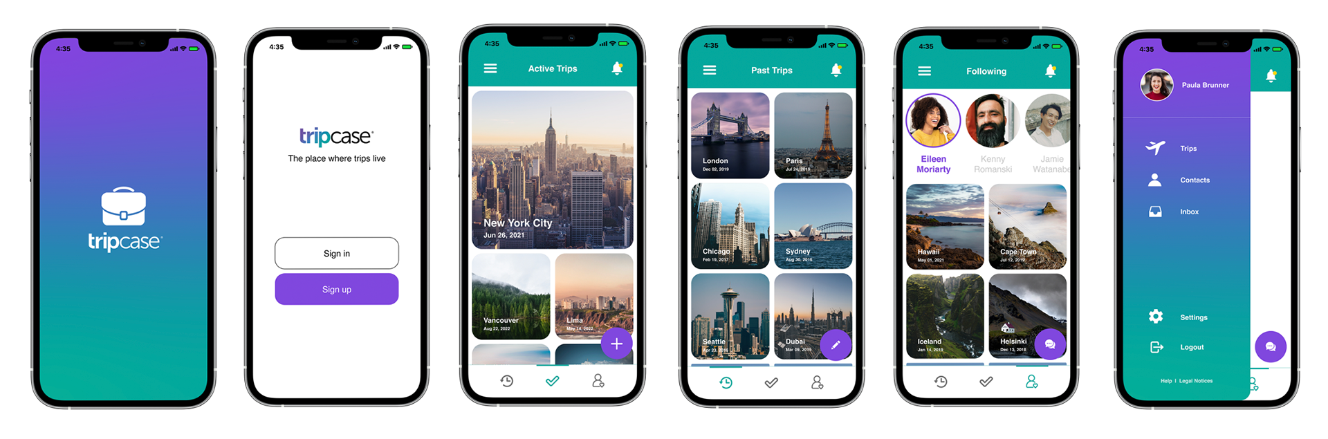
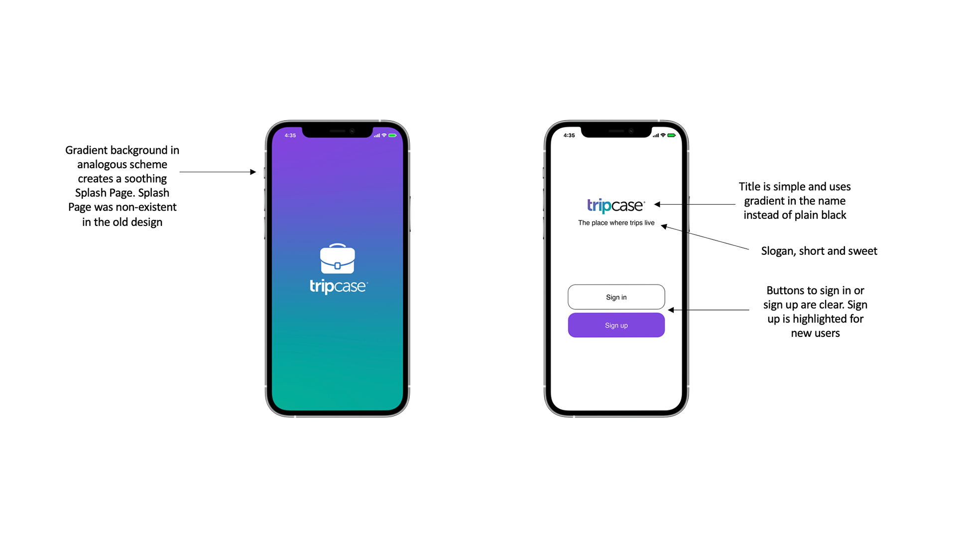
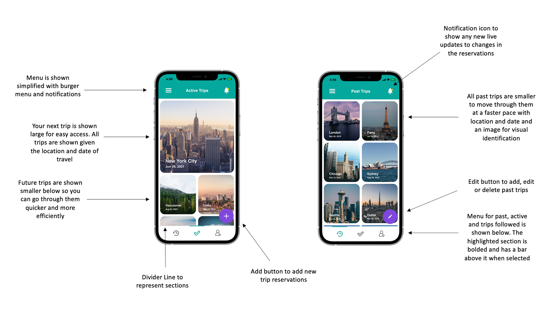
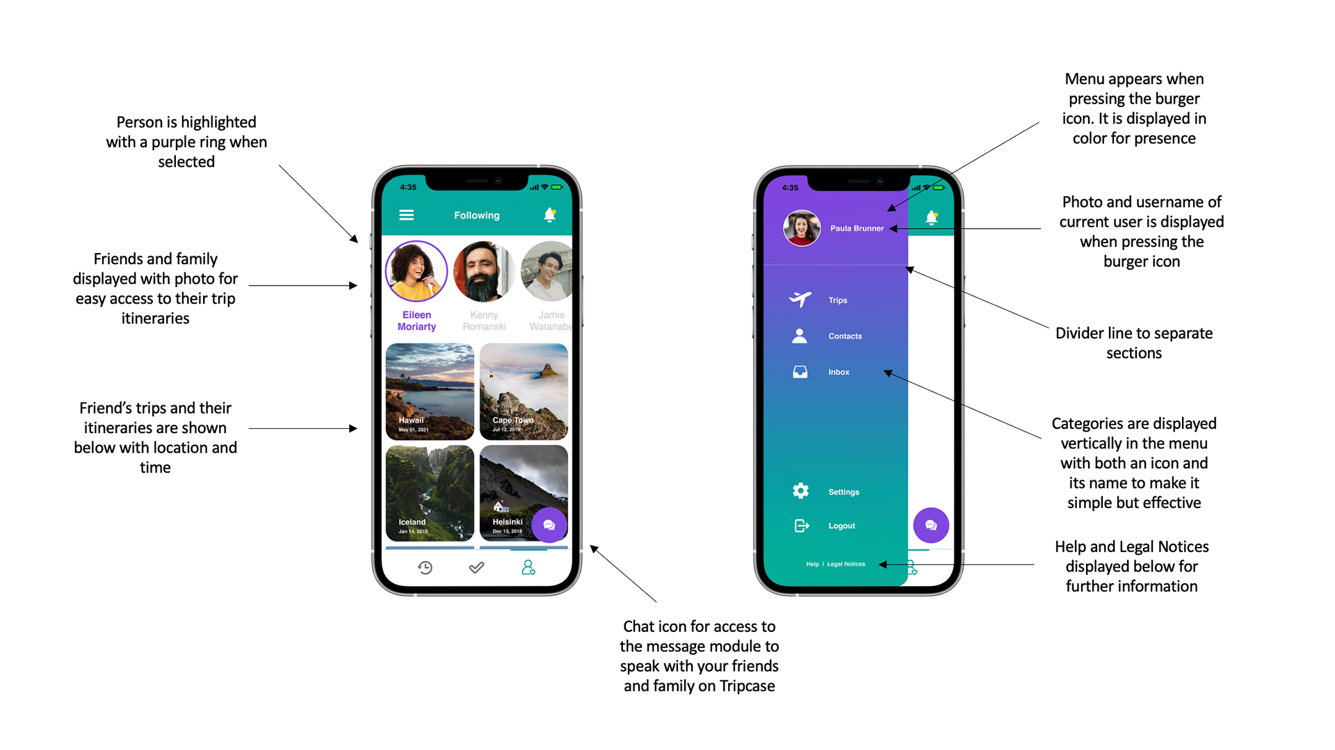
Concept: The chosen app to re-design was Tripcase. An app to organize all your trip details and travel plans into an itinerary. The idea behind the re-design was to create a much more aesthetic and easier interface with calming colors, making it easier to find and follow your travel details. In addition, large images would be used to remind of your trip by creating the visuals to gather excitement. By facilitating the interface, you can now find your most recent trip easily and contact your friends and family directly to make sure you are always up to date.
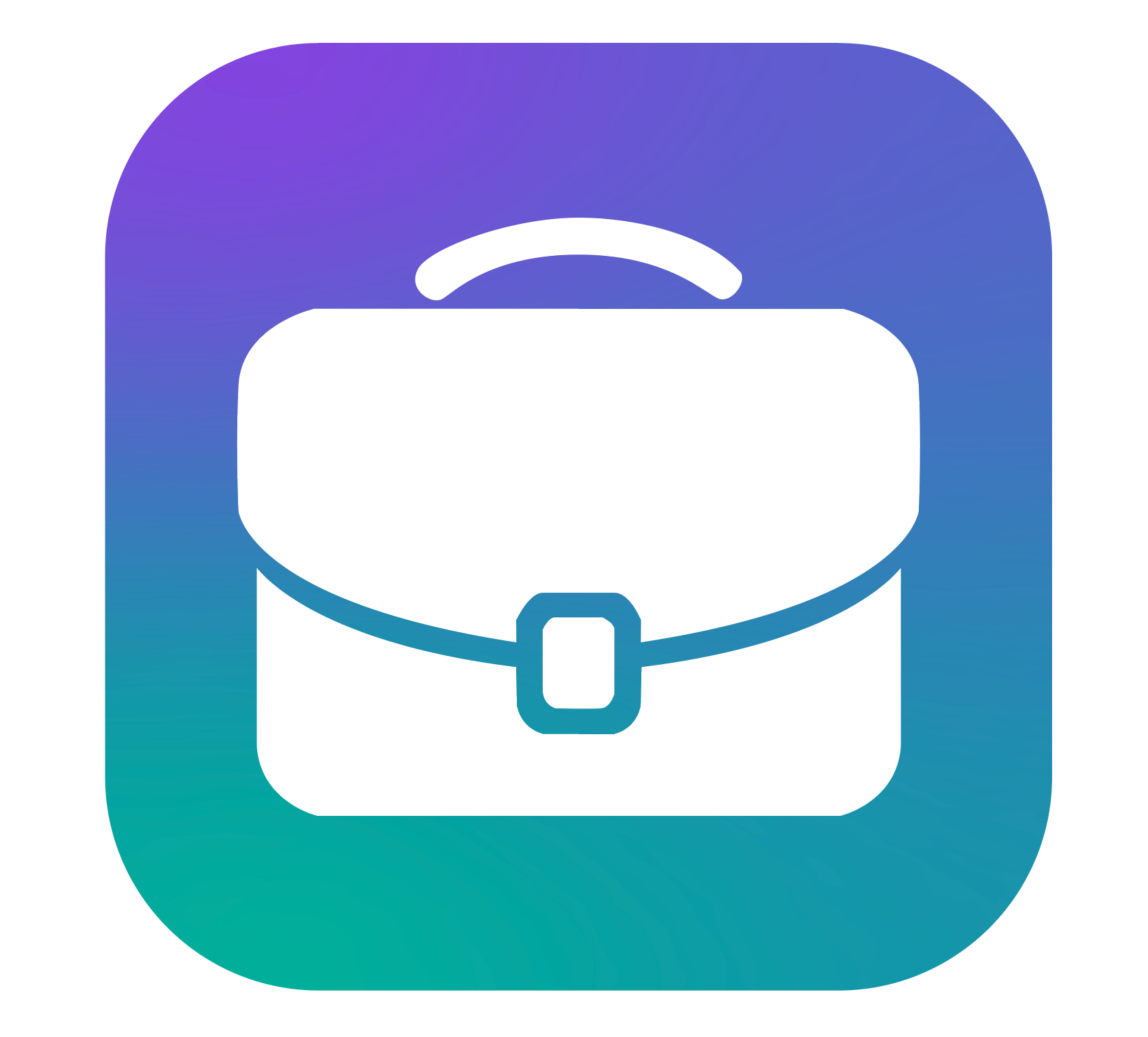
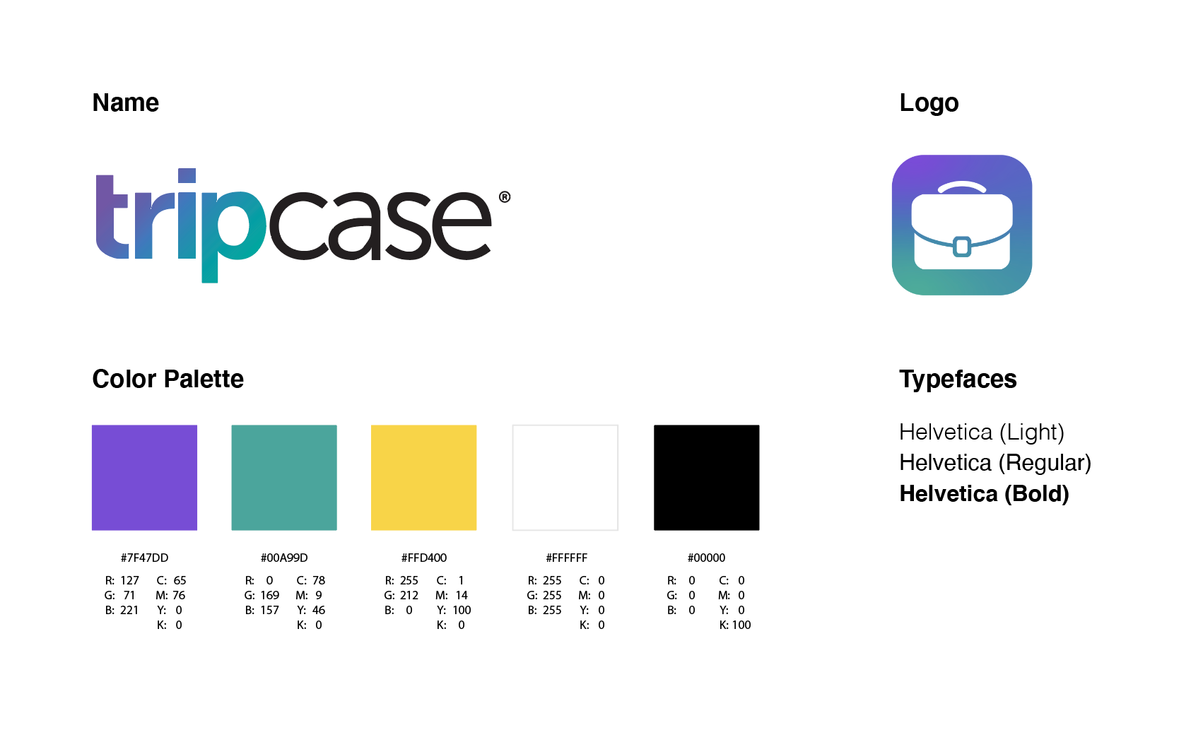
Old logo vs. New logo

Name | Logo: The name of the application was maintained as was said in the brief. However, the logo was updated using brighter colors in a soothing gradient to make it modern and eye-catching.
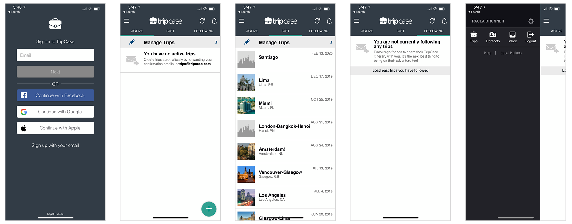
Old Tripcase Application Screens
New Tripcase Application Screens
Typefaces: Helvetica was used in different weights to provide hierarchy in the headers, sub-headers and body text. It is easy to read and modern, which goes with the rest of the re-designed aesthetic.
Color Palette: A purple and turquoise were used as the main colors for the app as they are calming and represent loyalty, serenity and responsibility. It is also used as a gradient to provide a smooth transition of one color into the other furthering the calming sensation. The contrasting yellow was used to represent the presence of a notification and make it easy to see.
Details: Use of UX/UI principles for the design of the application to make it easier to navigate and much more user friendly in general.
Re-designed Application ( 2532 × 1170 pixels )
Timeline: 3 weeks
Programs: Adobe Illustrator, Adobe Indesign, Adobe Photoshop, Adobe XD