
Packaging Design
Brief: Newcomers to the local brewing market, this company will be offering multiple types of beer brewed locally for the more developed beer enthusiast. With European style techniques, they want to offer the market something new and more interesting over the regular expected beers. They need to develop a brand look, identity and packaging for their products.
Concept: A beer company based on the concept of Alchemy, the predecessor of chemistry. The transformation of matter into gold with a universal elixir. It is meant to make it stand apart by creating a brand identity that represents the beer's value of gold in a modern, minimalistic form, pleasing a younger demographic of drinking age. It will become a brand you purchase, consume and then keep as a memento.
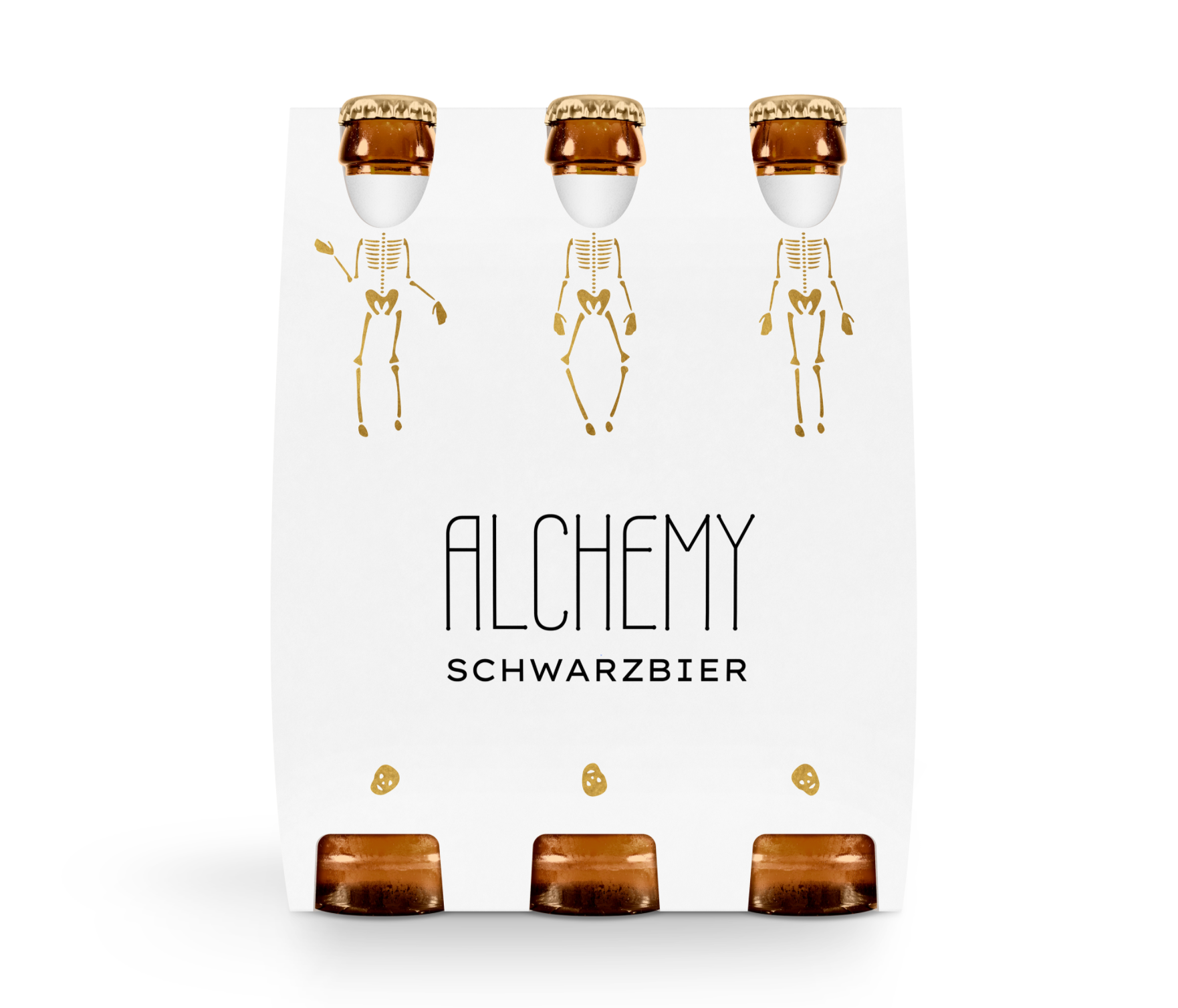
Beer Label ( 5 x 2 '' )
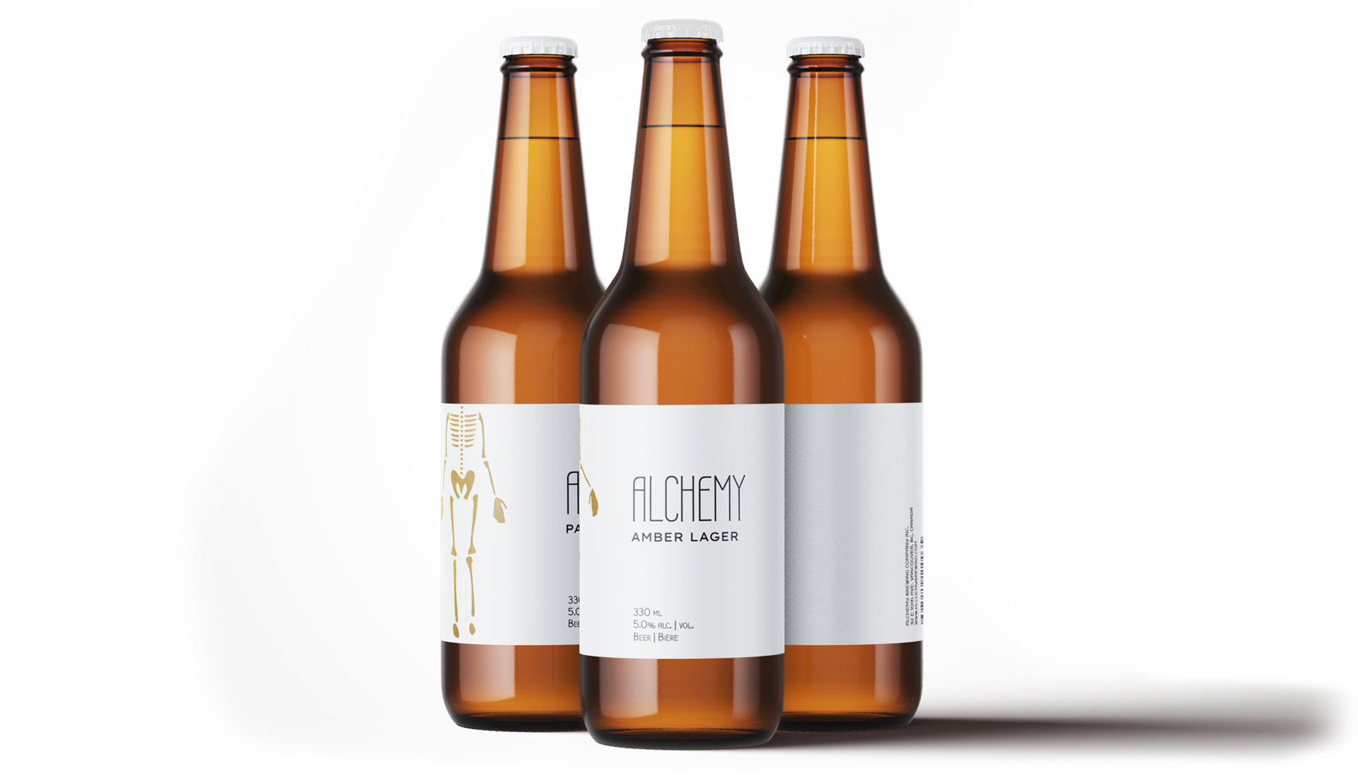
Name: Alchemy was the "medieval forerunner of chemistry, based on the supposed transformation of matter. Concerned with attempts to convert base metals into gold or to find a universal elixir." Beers are a range of golden colors. The name Alchemy was chosen to focus on this aspect as well as the ancient chemical process from which beer has been made for over the last 7000 years. It is about transformation and creating something valuable. Hence, completing the goal for the beer company's brand identity.
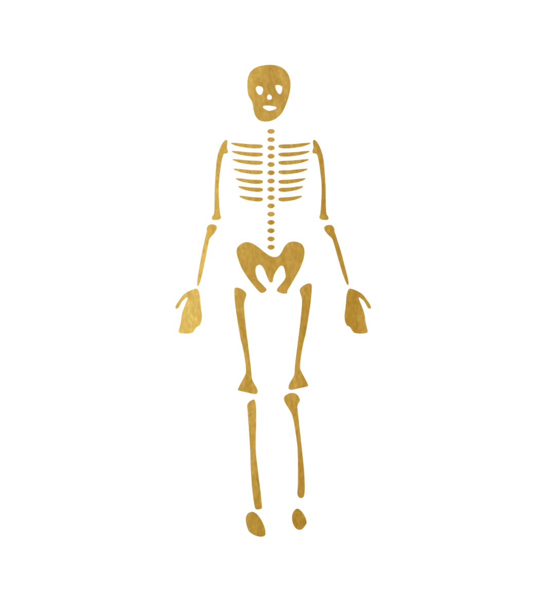
Logo: A golden skeleton to represent how old the process of making beer actually is, similar to alchemy itself. It also represents turning your body into gold by drinking the "universal elixir", which can make anything valuable. It is winking at the idea that if you drink this beer, you will become gold.
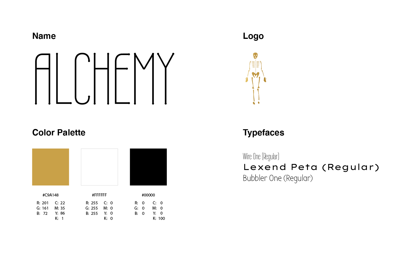
Typefaces: The fonts were chosen to be sans serif to keep a modern aesthetic but still provide a nostalgic feel. The three fonts allow for contrast and hierarchy.
Color Palette: The gold represents the alchemist and their search for the "universal elixir". Rich black and white were chosen to provide contrast and keep things modern, elegant and legible.
Beer Caps ( 1 x 1 '' )
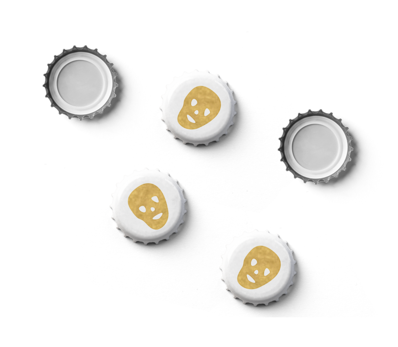
Slogan: The Golden elixir was chosen as alchemy is the science to convert materials to gold and finding this "universal elixir". An elixir is a magical potion, which describes the experience that the consumer will have when drinking the beer.
Packaging Design
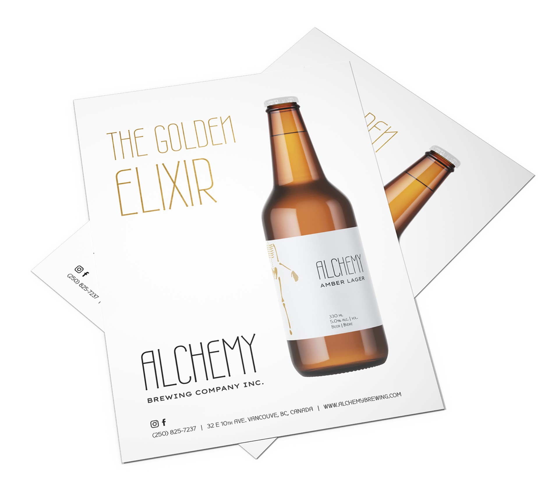
Printed Advertisements: The ad was created with the same minimalistic design to promote the slogan The Golden Elixir with a bottle shot. It also includes the company's name with their number, address, website and social icons.
Print Ad ( 33.1 x 46.8 '' )
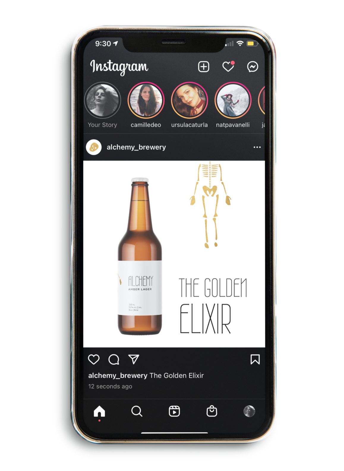
Digital Advertisements: Since the ad is on instagram, it was not necessary to add social icons or the number, address and website as you can find it on the profile's bio. Therefore, it is a simple bottle shot with the slogan and a play on the logo for comic effect.
Instagram Ad ( 1080 x 1080 pixels )
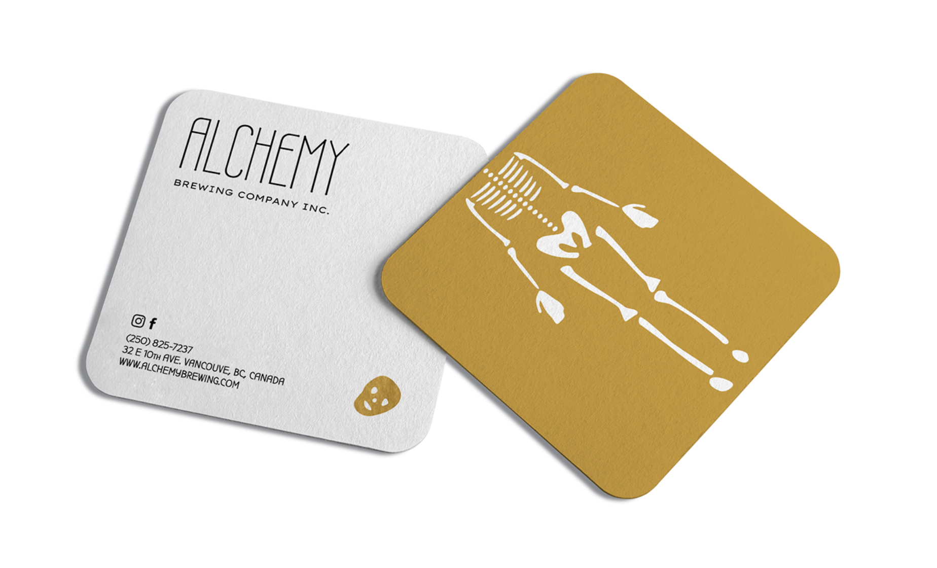
Business Card: The idea behind it being square is to make it stand apart from other business cards while still being able to fit in a wallet. Also, it gives a more modern feel and a quirky vibe. On one side you have the logo with only the skeletal body, while on the other side, you can find its missing head. On the business card it was important to showcase the company's name with the social icons, number, address and website.
Business Card ( 2 x 2 '' )
Timeline: 2 weeks
Programs: Adobe Illustrator, Adobe Indesign, Adobe Photoshop