
Brand Style Guide & Website

Brief: Elevate the Asignio brand to show trust, elegance and security. Design a brand guide to serve as a rule book for all collaterals and re-design current website to reflect this new brand style.
Concept: Asignio is a company that provides secure access to your accounts with a biometric multi-factor authentication system accessible on any of your designs. Therefore, I needed to create a new brand style that is trustworthy, strong and clean through the use of typography, hierarchy, colour theory, iconography and imagery. In addition, also bring this new style into the website.
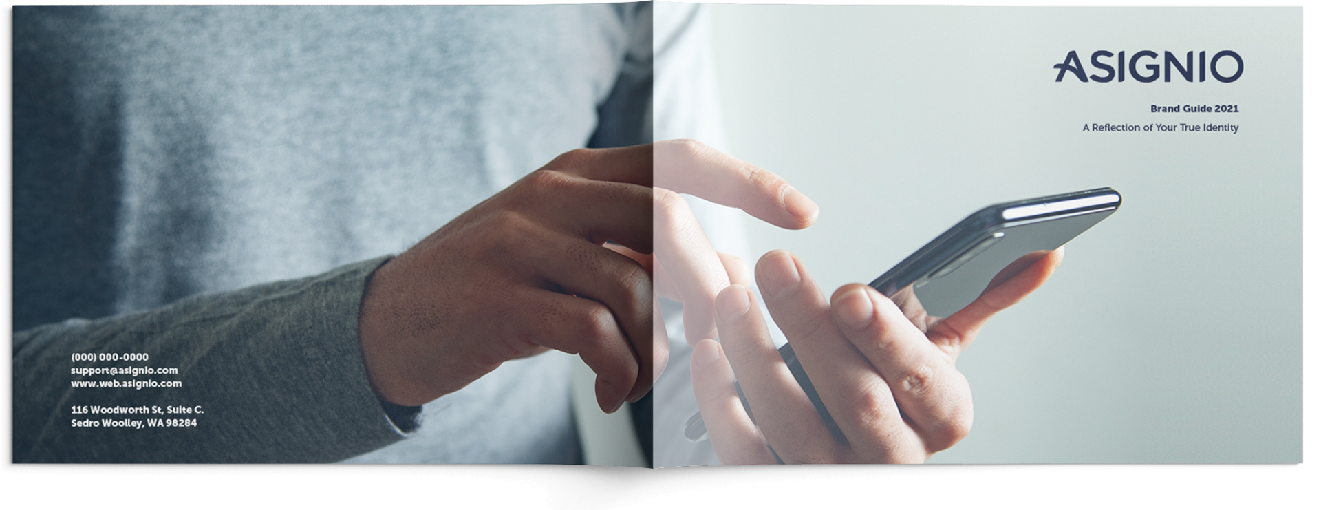
Brand Style Guide Cover ( 11 x 8.5 '' )
Name | Logo: The name Asignio was maintained. On the other hand, small tweaks were made to the logo and badge. Firstly, the colour scheme was changed to a deeper blue to show trust and dependability. Furthermore, the badge was made more geometric to depict sturdiness and responsibility.
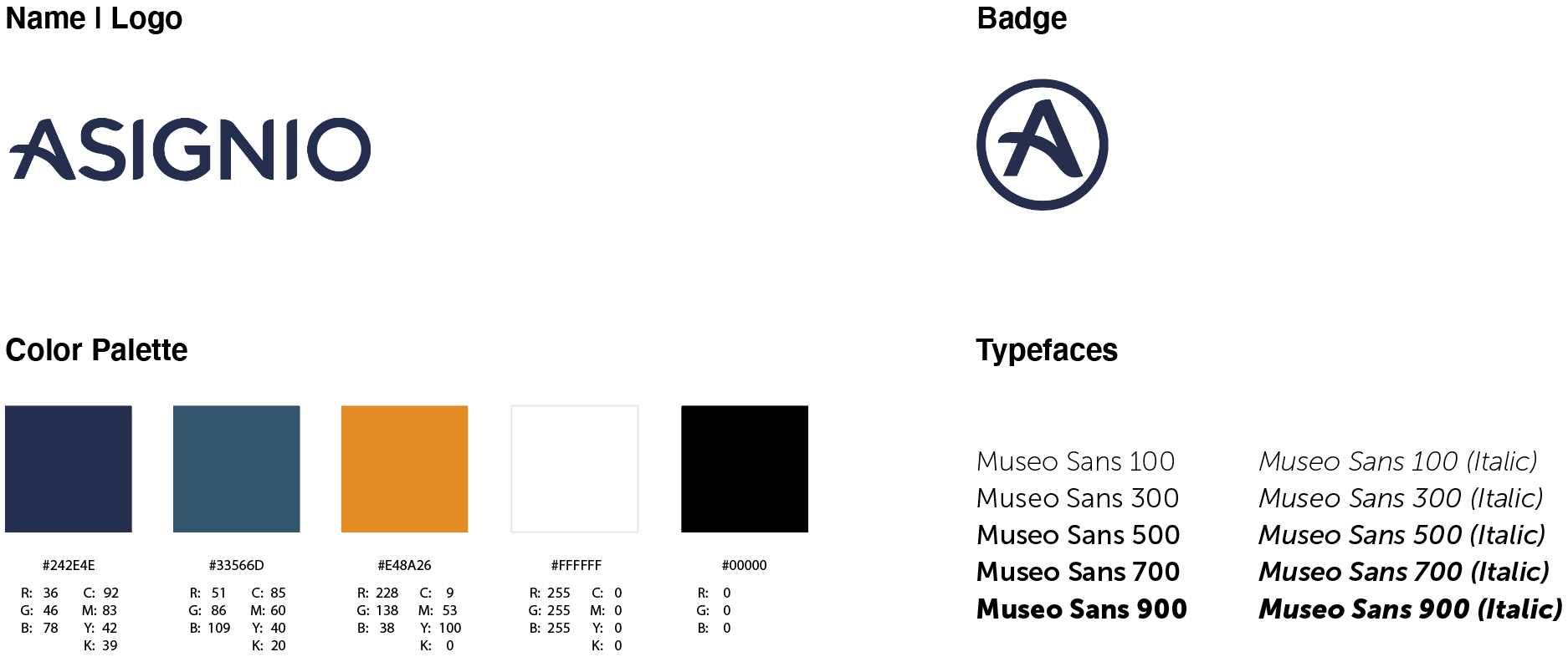
Typefaces: I chose Museo Sans as it had a large variation of typefaces and is a clean and legible sans-serif font. It is modern, easy to read and stands out to the audience, making an impact with bold and geometric lettering.
Color Palette: I decided to go with a deep blue for the colour of the Asignio logo to represent calmness, sophistication and trust. The secondary cooler blue was chosen for gradients such as splash screens for the app. The orange tertiary colour was chosen to contrast with the blue. The orange may be used for highlights such as notifications, but used minimally. Black and white are basics for texts and backgrounds to make them pop when mixed with photographs.
Magazine 2 Page Spread ( 17 x 11 '' )
Slogan: A Reflection of your True Identity is a slogan I created specifically for the brand guide. It plays on the company's service that uses synchronous biometrics for safe access to your accounts as well as the fact that this is Asignio's new identity as well.
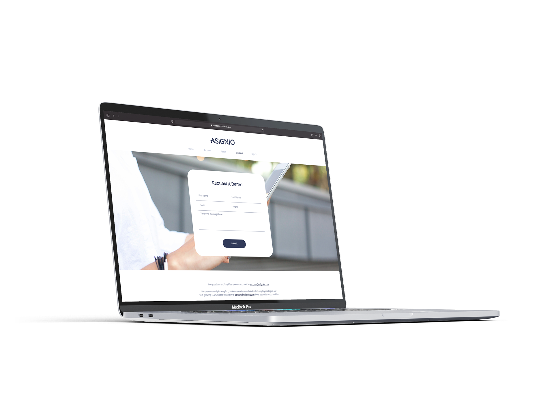
Macbook Pro ( 3072 x 1920 pixels )
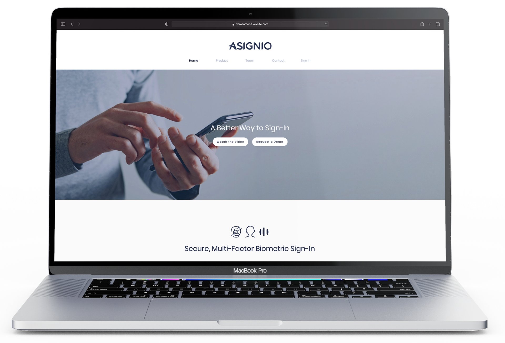
Website: Once the brand guide was created and finished, I was able to set up the website quite quickly. The client wanted me to create the website on Wix to have more accessibility to update it if necessary. Again, the design was simplified to look clean and elegant. It was designed with the customer in mind, meaning large visuals, the least amount of clicks to get where you need to go and having the most important information front and centre.
Macbook Pro ( 3072 x 1920 pixels )
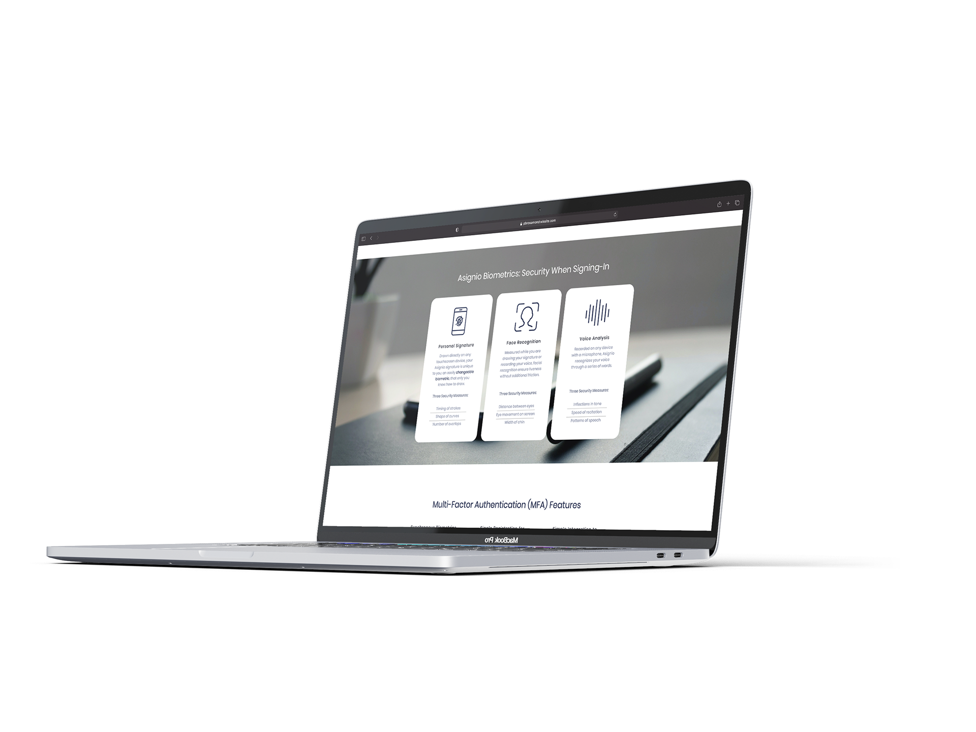
(Mobile Version in Progress)
Timeline: 2 months
Programs: Adobe Illustrator, Adobe Indesign, Adobe Photoshop, Wix (Requested by Client)