
Restaurant Menu & Wine List Re-Brand
Brief: A local restaurant needs an update to their food and beverage list in both a printed and digital format. Their logo needs to be updated along with their name to reflect their updated brand. They wish to reach a more high end customer base and desire to have more rich colour, styling, clarity, and an overall opulent feel conveyed in the menu to customers.
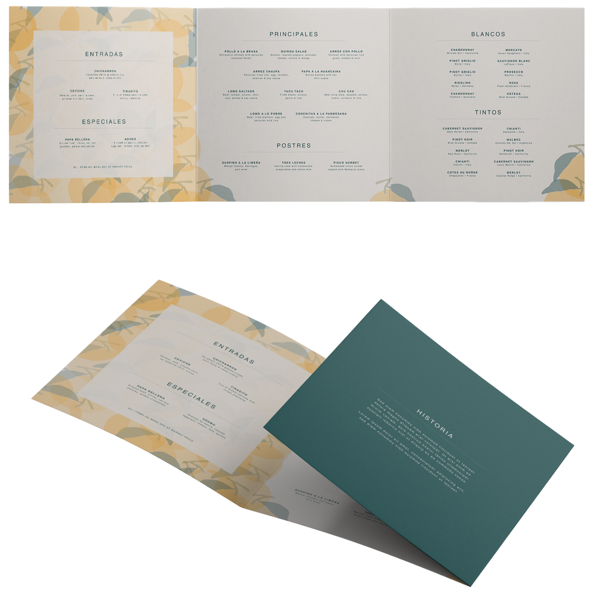
Concept: An elegant and exclusive Peruvian restaurant in the heart of Vancouver. A feast for the senses right in downtown where you can taste the popular citric flavors of Peruvian cuisine. The printed menu was created using a light background with dark text, which is best for reading under dim lights. However, the digital version needed to be designed using a dark background and light text as it is illuminated by the backlight. Bright colors with backlighting can be too bright and hurt the eyes of the reader, especially so in dim lighting. As you will see, prices will not be shown on the menu as elegant restaurants tend to remove them out of courtesy for other guests who are being invited out for dinner. This way they do not feel embarrassed for picking something expensive off of the menu. "All items on the menu are market price" message is found inside the menu for clarity.
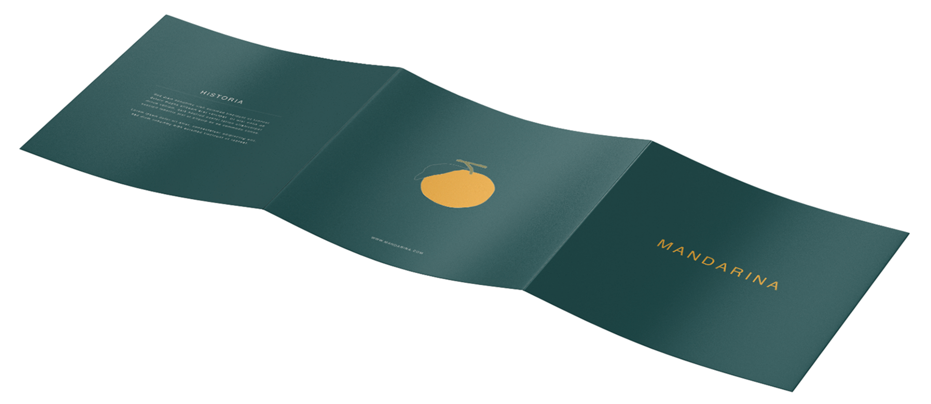
Trifold Brochure Exterior ( 25.5 x 8.5 '' )
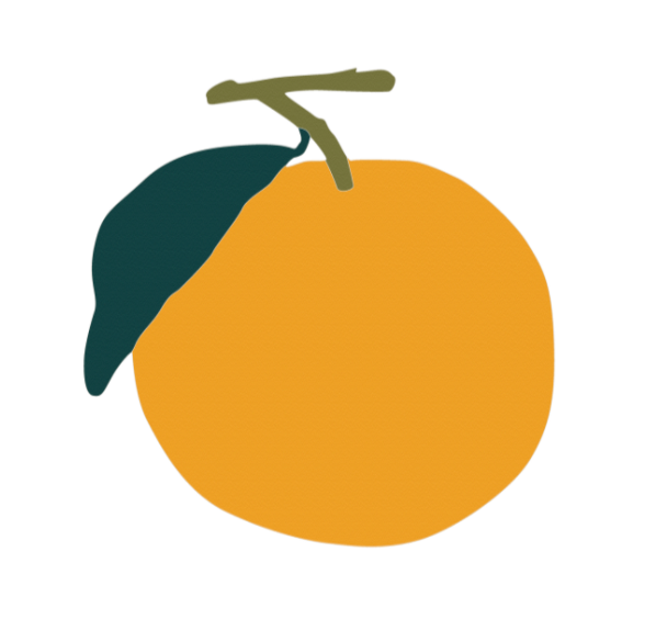
Name: The name Mandarina was chosen as it means mandarin in Spanish. Peruvian cuisine is strongly influenced by Asian culture, creating plenty of fusion dishes. In addition, Peruvian food uses many citric flavors and bright colors in their dishes like the bright yellow-orange found in the mandarin fruit. Mandarina is also used as slang for a person who helps around in the kitchen.
Logo: The logo is a simple mandarin fruit. It was chosen to represent freshness, the bright colors and citric flavour found in Peruvian food. The mandarin logo still has the stem and leaf to show that the ingredients are newly-harvested and natural.
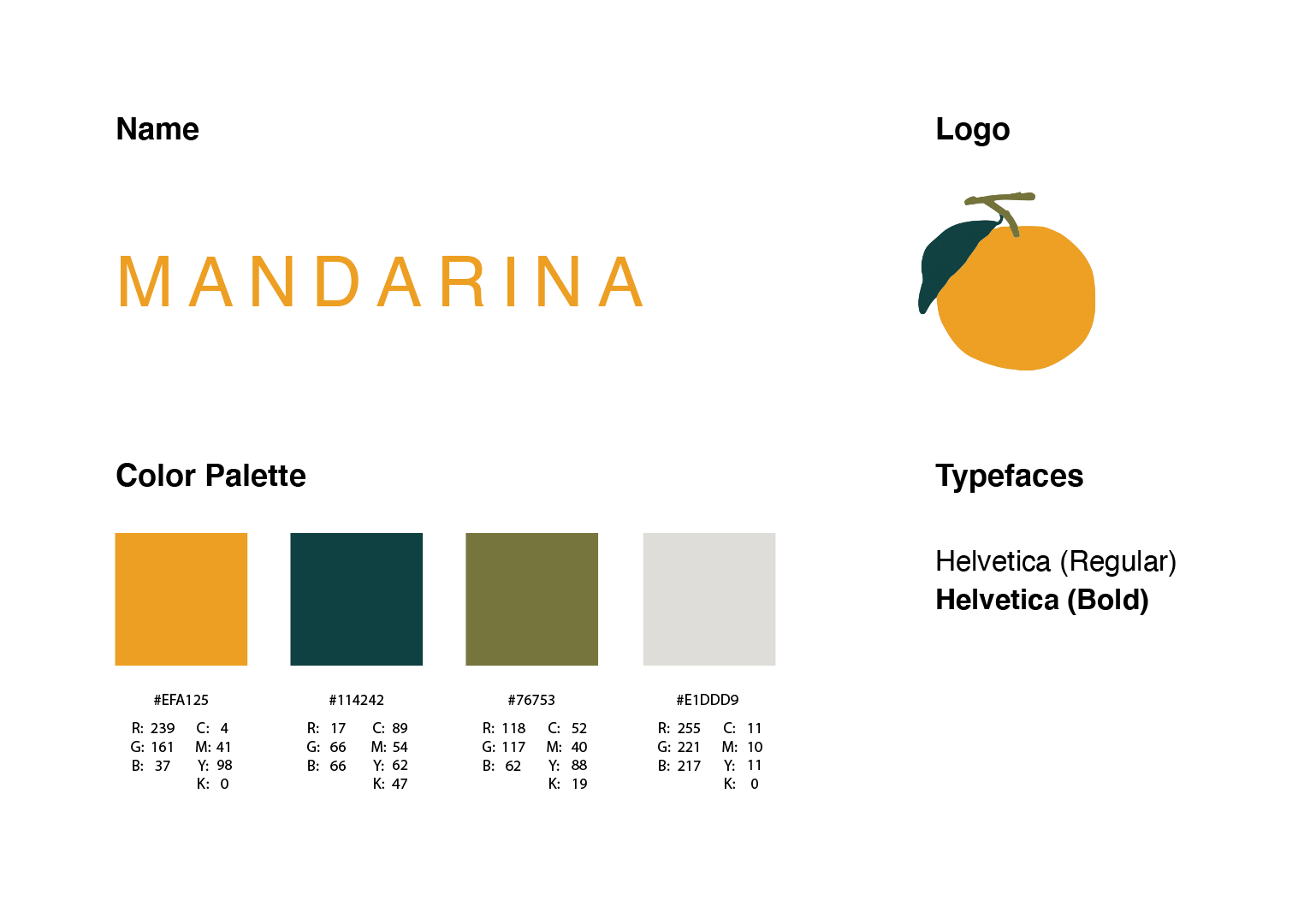
Typefaces: It is well-known that most menus use Helvetica for their body text due to legibility. Therefore, Helvetica was chosen as it is clean and easy to read.
Color Palette: The bright orange and dark green tones were chosen to represent the mandarin fruit and create contrast. They are rich colors that show the cold and warm tones of the fruit, yellow depicting the citrus and dark green the freshness. The off-white, on the other hand was used to reduce the garish brightness of a pure white sheet of paper and make it easier on the eye.
Trifold Brochure Interior ( 25.5 x 8.5 '' )
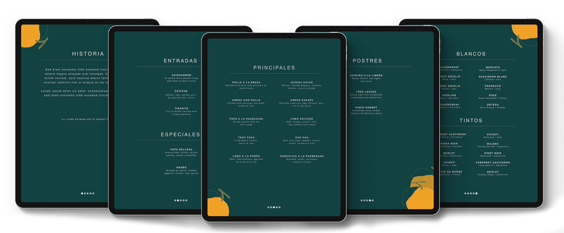
Digital Menu: In contrast to the printed menu, the digital menu for the iPad had to be created on a dark background due to the backlight in order to not hurt the readers eyes. It was designed using pages instead of an infinite scroll in order to have each category on each page, facilitating the process of finding your desired food or drink. Accents of the mandarin were also placed throughout each page to brighten the menu and maintain the logo throughout.
iPad Pro ( 2048 x 2732 pixels )
Timeline: 2 weeks
Programs: Adobe Illustrator, Adobe Indesign, Adobe Photoshop