
Organization Re-Branding

Brief: Re-brand chosen non-for-profit organization, Music on Main by designing a new logo and producing an updated ad campaign.
Concept: Music on Main is a non-for-profit organization that provides access to events in public spaces to build community where you may meet and speak to the artists after the show. Although they focus on classical music, they are now offering more in terms of dance and acting. My vision was to modernize Music on Main for younger audiences and get them involved in the classic arts at a younger age. Currently, Music on Main's logos and campaigns do not show what they provide in their showcases. Therefore, the logo was completely redone and a new campaign was launched to bring in a larger demographic that describes everything this organization has to offer.
Old Logo vs. New Logo
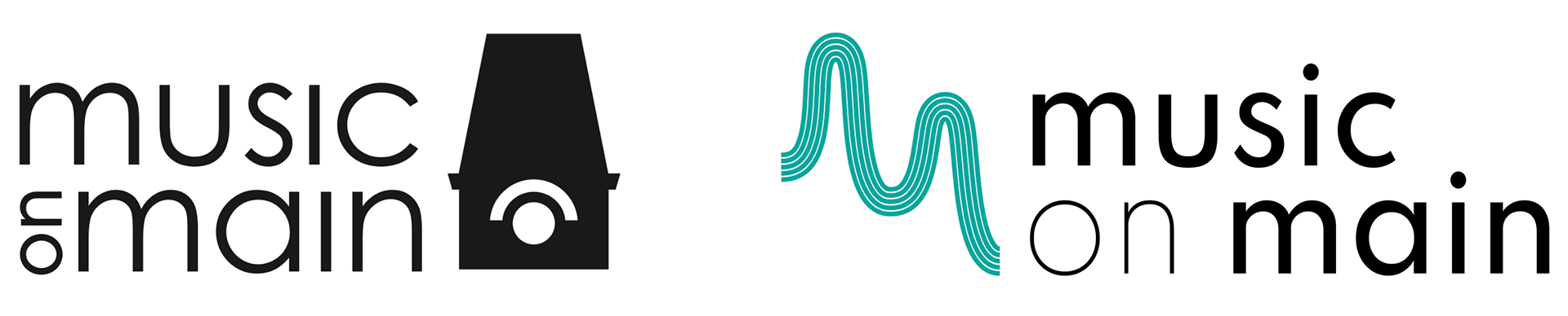
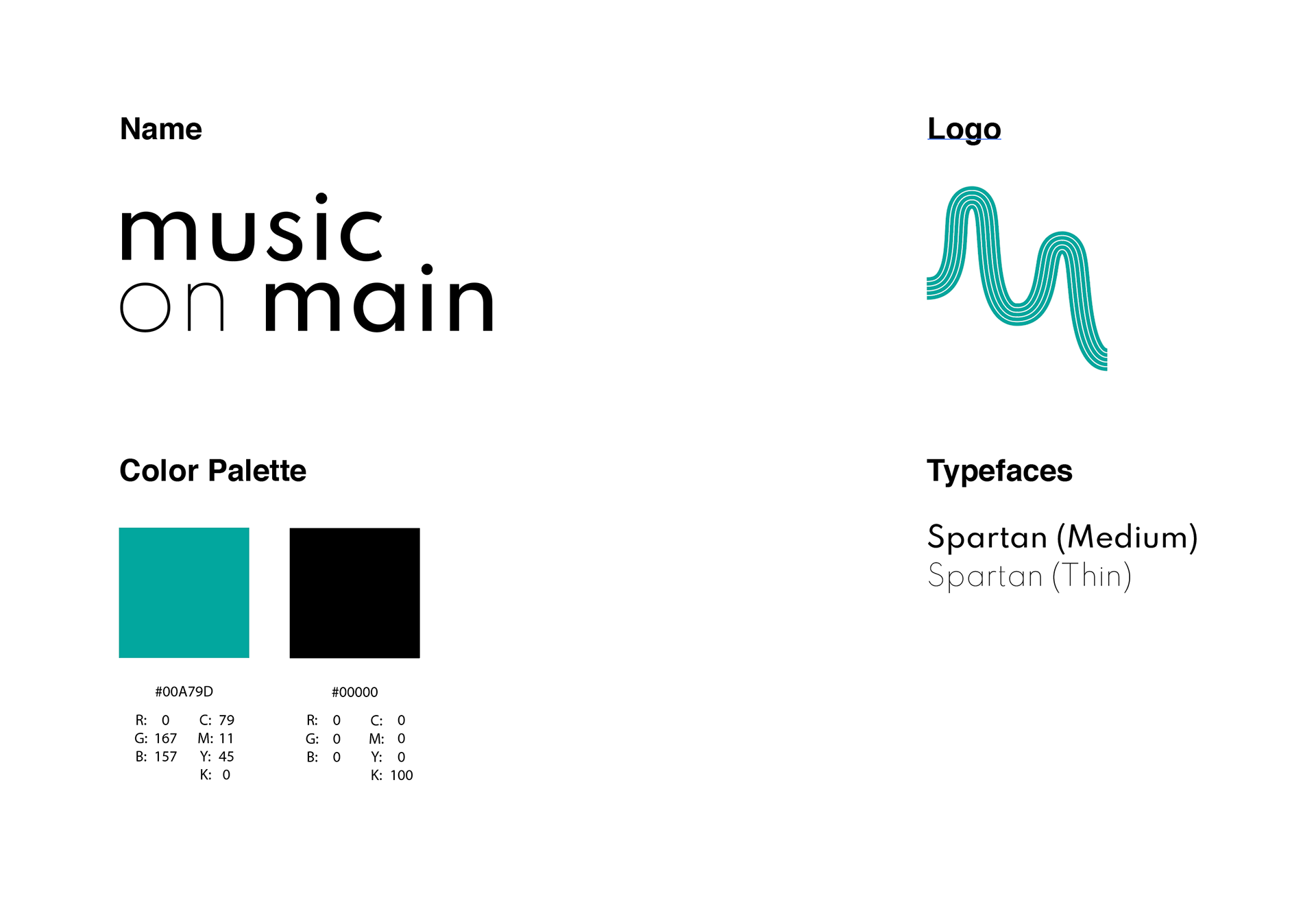
Name | Logo: The name of the organization was maintained. However, the logo was re-designed using the "m" provided from the double consonant in Music on Main as the main visual. The "m" is created using five lines, which comes from the musical pentagram in sheet music. It also represents the flow and movement of a performance. By creating a simple bent shape, it is easily identifiable whether as the logo itself or as part of the background.
Logo Vertical and Horizontal Variations
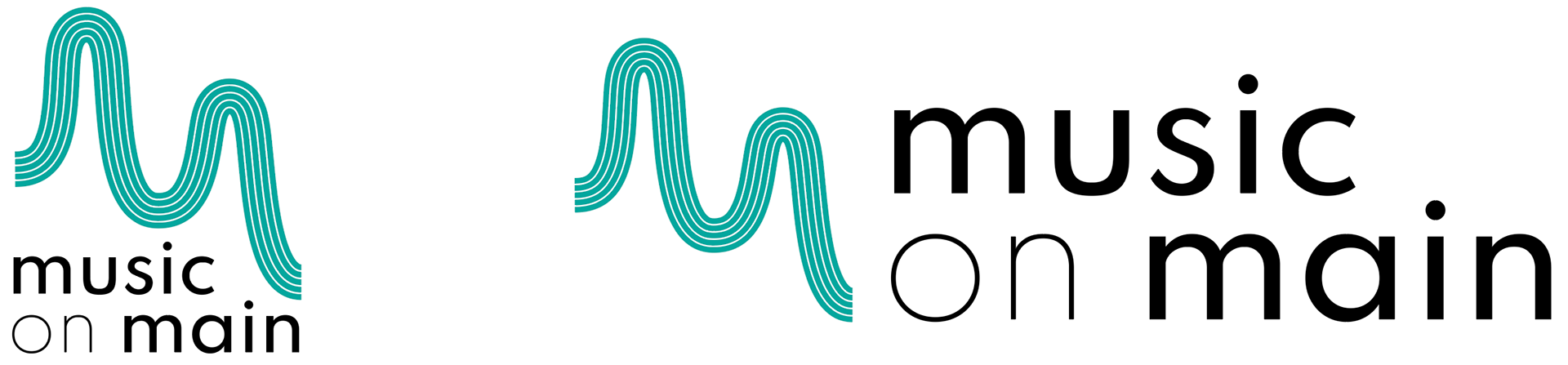
Typefaces: The font Spartan was used for the logo text as it is a modern sans serif in a large family of different weights to help emphasize specific words. The text "music" and "main" were the most important in the logo and are therefore bolded, while the "on" is thin and reduce attention on the linking word.
Color Palette: The turquoise color was chosen to represent community and to call attention to the logo itself. It is bright and modern and calls to a younger demographic as well.
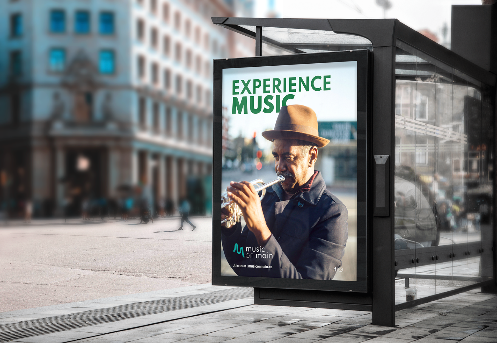
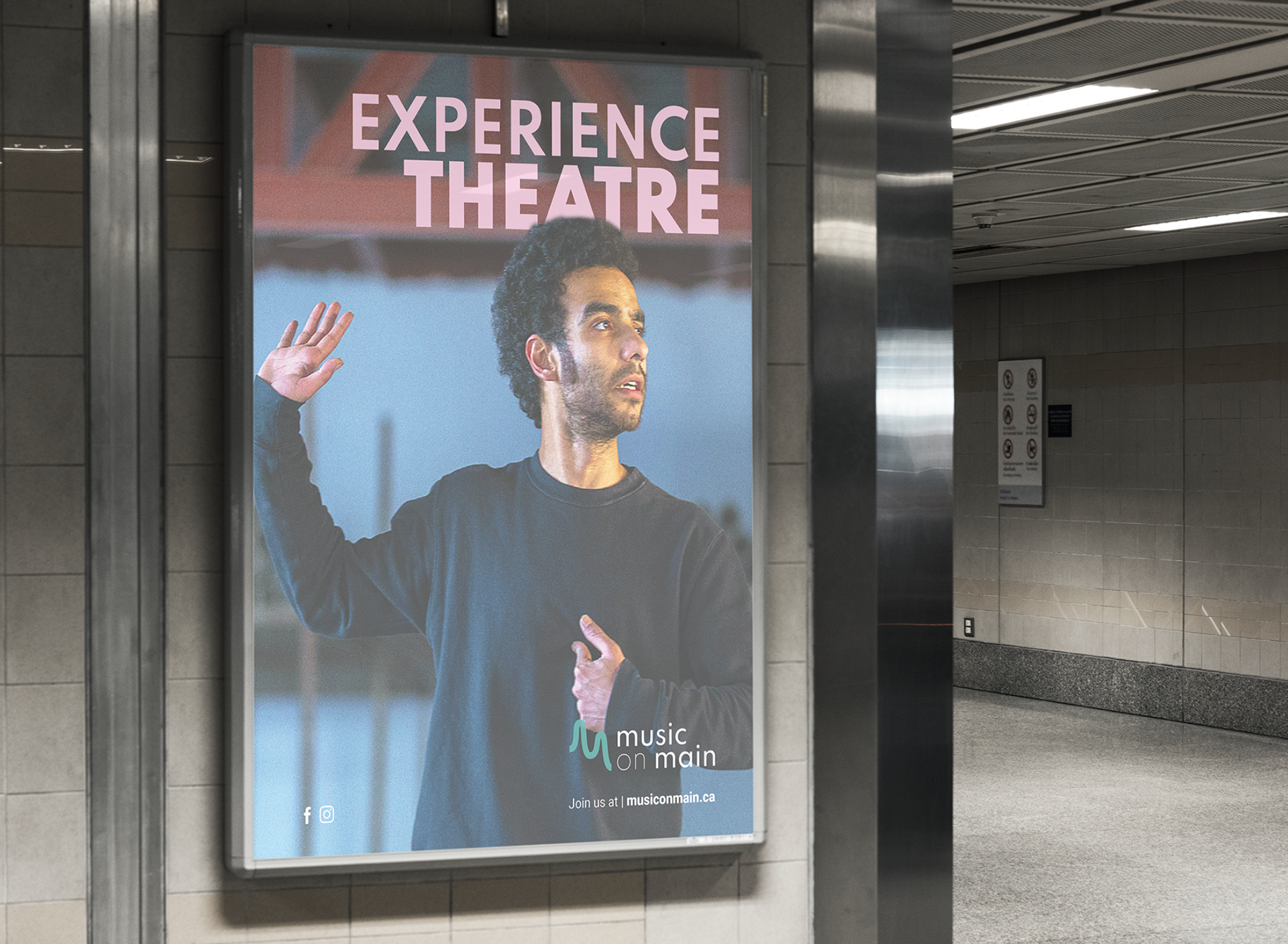
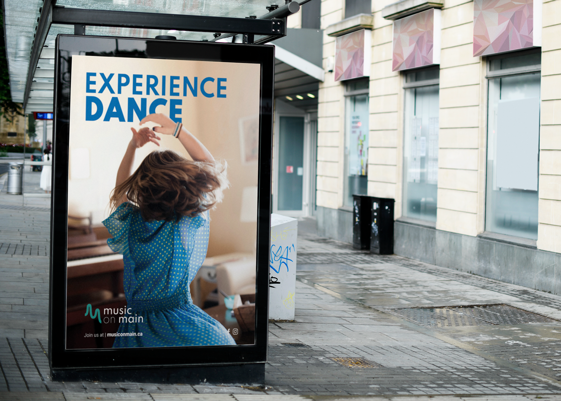
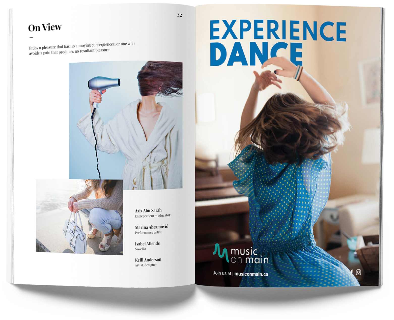
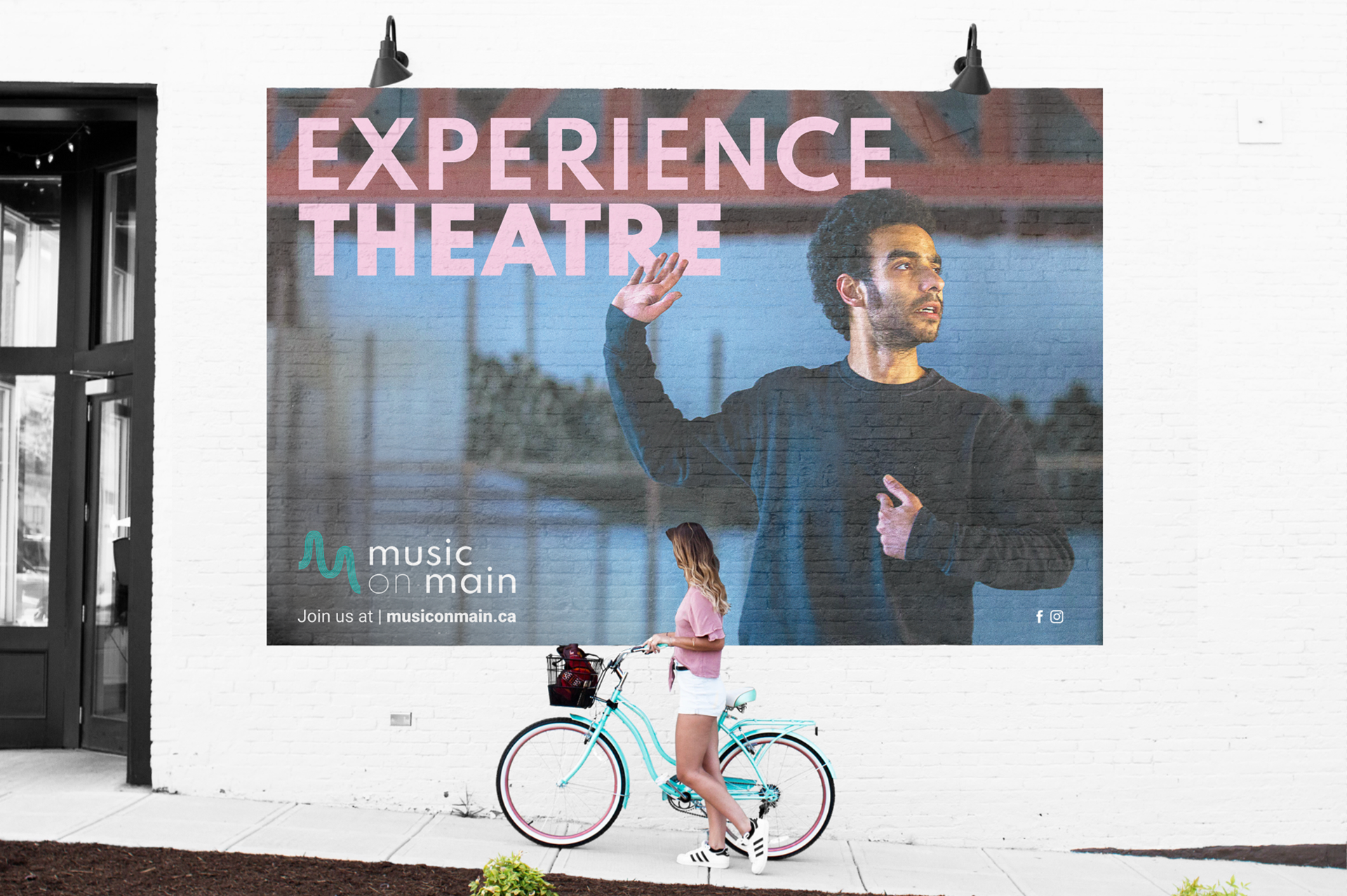
Ad Campaign: Designed to describe everything that Music on Main has to offer, and not just music. It shows people enjoying their experience in common spaces to allude to the idea of the music being public and easily accessed. A space to connect with others and the music, a place to experience more than just music. It is directed at an audience of both men and women between the ages of 18 to 50 by showing a range of different subjects in each of the three ad designs.
Flyers ( 8.5 x 11 " )
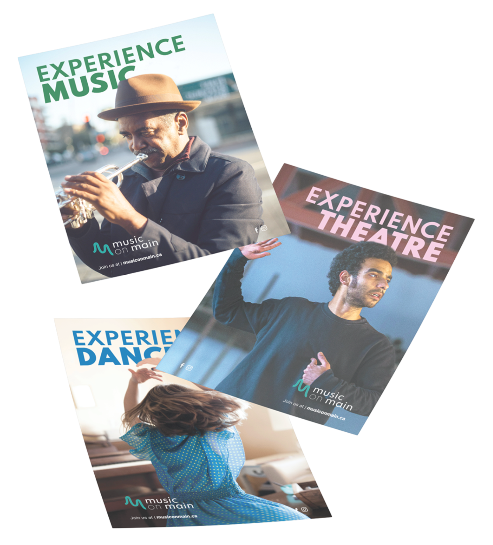
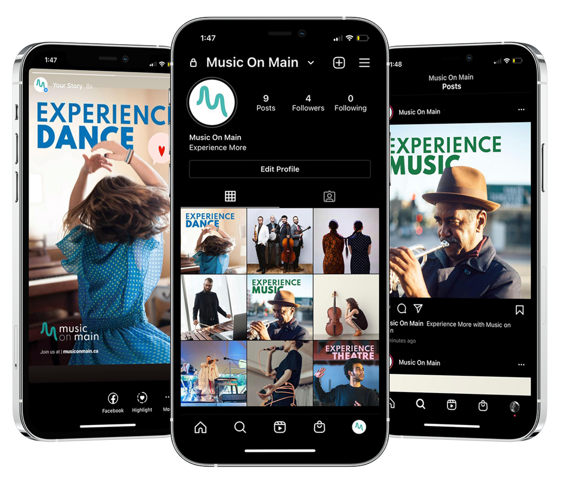
Slogan: An important word in the world of art is "experience" because that is what you are selling. Therefore I wanted to go with "experience more". However, I decided that I wanted to be clean and straightforward with what Music on Main offers by making the tagline Experience Dance, Experience Theatre and Experience Music. In conclusion, Experience More with Music on Main.
Billboard Ad ( 48 x 70 " )
Ad Strategy: Psychological sell – The campaign is selling the feeling and environment of being surrounded by music.
Ad Style: Narrative and Informal Dialogue
Delivery Vehicle: Pop culture
Magazine Ad ( 8.5 x 11 " )
Alternate Layout: In addition to the vertical layouts, horizontal layouts were necessary for large street billboards, postcards or murals. Therefore I created a horizontal layout to show what the ad would potentially look like and how this ad can be used in any perspective while still sending the same message.
Mural Ad ( 27 x 40 " )
Social Media: I wanted to carry the ad campaign into social media by simplifying the designs for Instagram. The images were carried over with the tagline but removing the social icons, logo and website as they are easily accessed in the bio of the application.
Instagram Post ( 1080 x 1080 pixels ) | Instagram Story ( 1080 x 1920 pixels )
Timeline: 4 weeks
Programs: Adobe Illustrator, Adobe Indesign, Adobe Photoshop