
Multi-Platform Magazine Layout
Brief: A new modern print and digital download magazine is being developed and they need branding, promotional images and previews for their marketing team to get funding.
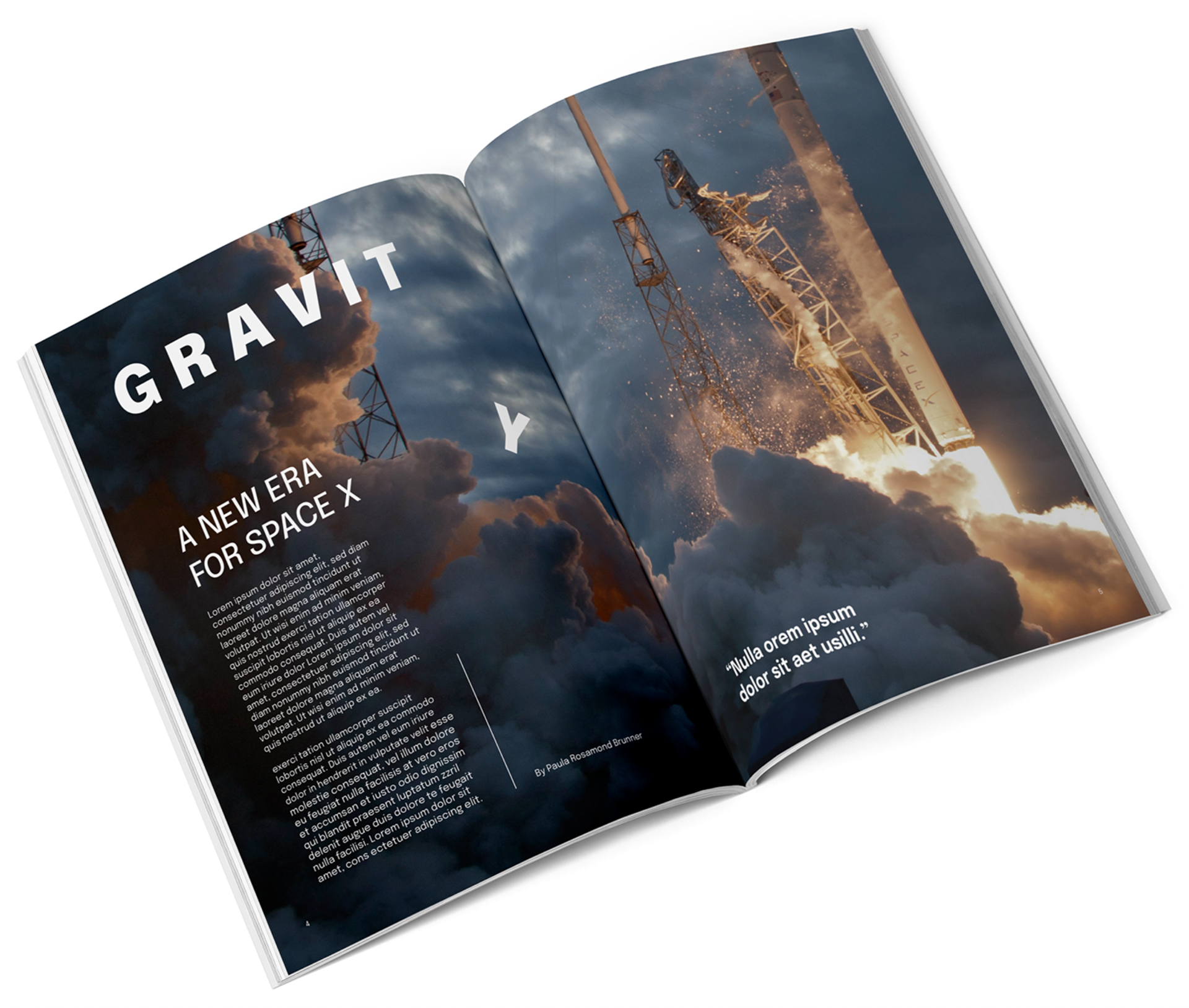
Concept: Create a scientific magazine that was modern and would make younger audiences want to pick it up and learn about astronomy and the universe. Current scientific magazines are overcharged with information and tacky. Therefore, I needed to design a clean layout with large eye-catching images and bold typography to capture attention and provide a lasting impression.
Magazine Cover ( 8.5 x 11 '' ) | Magazine 2 Page Spread ( 17 x 11 '' )
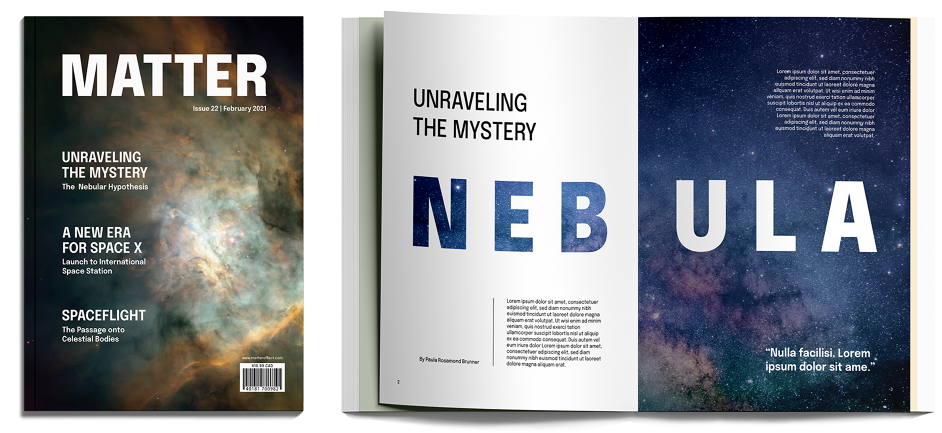
Name | Logo: The name Matter was given as it is the substance from which everything is made; Anything with mass and volume. It also plays as a pun meaning that science and the universe matter and we should learn about it more to develop our society and reach new levels of paradigm shifting ideas. As a the logo had to be comprised of the name, I simply made it in large bold letters for impact towards the customers purchasing the product.
Typefaces: I chose Epilogue as it had a large variation of typefaces and is a clean and legible sans-serif font. It is modern, easy to read and stands out to the audience, making an impact with bold and geometric lettering.
Color Palette: I decided to go with the simplicity of black and white to make sure that the bold imagery did the talking instead within the magazine. They are at the two ends of the spectrum, similar to space itself. The black represents the emptiness of space while white represents all of life and movement within it.
Magazine 2 Page Spread ( 17 x 11 '' )
Slogan: Matter of Fact is a hidden slogan that can be found in the web url above the barcode on the printed version. It is also the url to find the digital version of the magazine for the tablet and phone. Science is a Matter of Fact and not fiction. We need to learn more to improve the world in which we live in today and make epic discoveries.
iPad Pro ( 2048 x 2732 pixels )
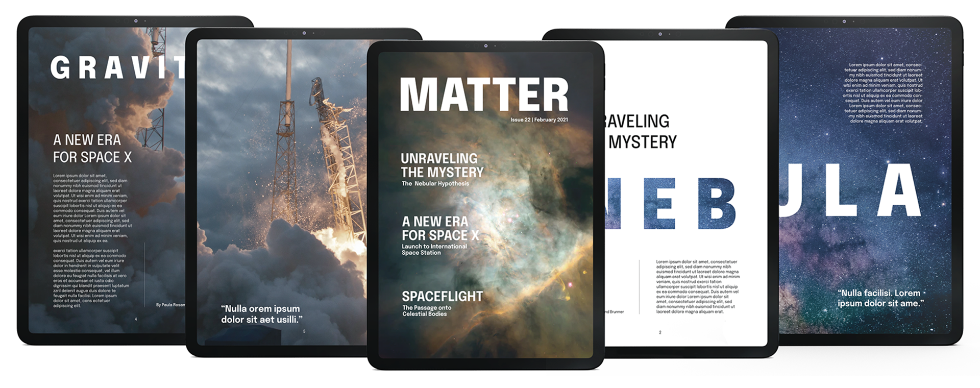
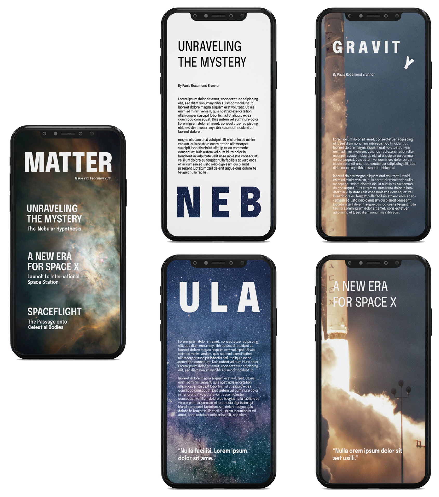
Digital Version: The digital versions were a challenge as it meant reorganizing the layout of the print magazine and still causing the same effect with the images and typography. Therefore, I kept the horizontal pages layout for the iPad. However, for the iPhone, I was able to move the layout from a horizontal expansion into a vertical one to keep the bold impact and the aesthetic for it to look like the same magazine in both the print and digital.
iPhone 12 Pro ( 2532 × 1170 pixels )
Timeline: 2 weeks
Programs: Adobe Illustrator, Adobe Indesign, Adobe Photoshop